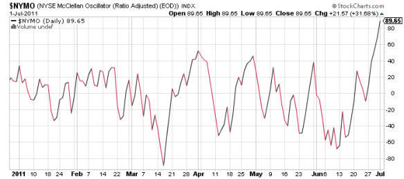
As a service to my readers, in case publication of my article at SA this week is not in time for the Tuesday open: the NYSE Arms Index and McClellan Oscillator closed Friday at a level which indicates a heavily bought condition in the very short term. This suggests we may see a significant pullback early in the week. Be careful!
Category Archives: Stocks
Midweek Update
It’s been an interesting week in the markets. The SPX is up more than 2% after two nice up days. Volume however has been weak even for Summer trading.
End of quarter window dressing? Probably. Sucker’s rally? Maybe, but so long as we stay above that 200 day line, it’s difficult to get overy bearish. Also going for the bulls: 10 year yield jumped 4% today to close with a 3 handle, and Dollar index fell below 76.
Yes, we’ve been focused on the macro risk in this space recently, but as always, what matters most is the market’s reaction. I’m not quite ready to fire off a bunch of buy orders, but as long as we’re feeling optimistic, how about this one coming off support:
Should the Greeks decide to play nice, and the end game is put off for another few months, we just might find we have a nice tradeable rally on our hands.
Chart of the Day: SPX Waves
Before we get into today’s post, an apology to readers – those few who still visit this space. With a heavy schedule of commitments, time just hasn’t permitted me to do the amount and quality of writing I would like to do. It isn’t likely to get lighter soon. The weekly column at Seeking Alpha is about all I can fit in.
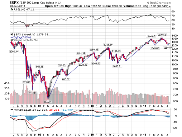
Now on to the post. Here we have a chart of the SPX with waves drawn at minimum 7% corrections. The 7% figure is a “soft” stop loss recommended by Investor’s Business Daily founder William O’Neil in his books, and I have found it to be very useful in identifying corrective phases in the markets.
The chart shows a five wave move off the March 2009 bottom, followed by a five wave correction which retraced 38% of the move, and another five waves up to the April top. The current correction has retraced 31% of the second up move. In the always subjective task of counting waves without the benefit of hindsight, the current market phase could be a sideways correction…or the early stages of a second wave bounce in another five wave correction.
(click on chart to enlarge)

Approximate Fibonacci retracements of the June 2010 to April 2011 move would be:
1,233 – 38%
1,191 – 50%
1,148 – 62%
My most recent weekly outlook anticipated a short squeeze rally this week and possibly another leg down in the correction. Elliot wave and Fibonacci analysis suggest that is a probable scenario. My suspicion is that the 50% retracement, representing a return to the congestion area from November, is a likely target.
Midweek Update
I will keep this brief, as I’m super busy and pressed for time. The US stock market is looking pretty ugly. This isn’t news to anyone who follows the market on a consistent basis, but I will give you my read.
In the very short term, we are oversold; we can expect a bounce to the 1300-1320 area on the SPX. At that point we need to watch how the market reacts. The internals are quite weak. A failed rally attempt in that range would likely bring us back to re-test 1250 in short order. I am really looking for support to firm up in the 1220s.
That is not a disaster scenario by any means (unless you are heavily levered long), but does represent a significant correction. My expectation at this point is to sell the bounce unless we move back up with good volume. A break above 1350 would negate that outlook.
Next support levels are round numbers where the index broke through previous resistance: 1200 from November and 1100 from last July-September
Looking Back at May…and Ahead to June
On May 1st (Sunday) my weekly outlook article on Seeking Alpha considered whether this would be a good year to follow the old market dictum: sell in May and go away.
My recommendation then was to sell commodities and hold stocks and bonds. Let’s see how that might actually have worked out using the most widely held ETFs as proxies for these asset classes. June price returns were
Common Stocks (SPY); 1.12% loss
Multi Sector Bond (AGG); 1.24% gain
Commodities (DBC); 5.17% loss
All in all not a bad call; a balanced portfolio of stocks and bonds broke even on a capital basis and holders collected some dividends for their trouble. My preferred proxy for a drop dead simple portfolio, the Vanguard Balanced Index Fund (VBINX) was minus 0.18% in May.
As we get into June, poor economic data is beginning to accumulate, and bond yields are continuing to fall in surprising fashion. In my most recent SA article I forecast a 2 handle on 10 year Treasury yields; as of this writing we are already there. The ability of the S&P 500 and the Russell 2000 to remain above support levels, at 1340 and 840 respectively, is something I am watching closely.
I am not bearish on stocks at this moment. We could be seeing these indexes (and a number of leading stocks) building new bases at current levels…but an inability to break out to new highs, or a break down through 1300 on the SPX and 810 on the RUT – especially with volume – would turn my outlook to negative.
Commodities still look like a sell to me. For bonds, I expect to see the ten year get to 2.6 – 2.8%.
Defensive Sectors Hit Hard
After leading the market through the month of May, defensive stock sectors are selling off aggressively this week. Monday saw the health care SPDR (XLV) gap down from last week’s level on heavy volume. Today we had a similar high volume drop in the consumer staples (XLP). This came as the Goldman buy call on commodities pumped up those parts of the market.
Is this the beginning of a rotation back out of defensive and into aggressive positioning? Not sure I buy it. Those markets had gotten pretty extended, and it wasn’t much of a pullback. My take is that there is likely more selling to come in the commodities (subject to revision, as always, upon any geopolitical blowup).
I am long both XLP and XLV, and will now have them on a very short leash.
GDP Growth and Stocks
This week fellow Seeking Alpha author Jeff Miller of NewArc Investments wrote
While the market is not a GDP futures contract, it does have a good long-term relationship with economic growth
This is something I had been thinking about for a long time: the direct relationships between GDP growth, stocks, bond yields and inflation. In order to quantify the specific GDP-stock market correlation, I went through the following exercise.
Using Federal Reserve data published for a 50 year period from 1960 to 2010, find the Pearson correlation coefficient for two data sets: Year over year change in nominal GDP, and Year over Year change in the average annual price level of the Dow Jones Industrial Average, both contemporaneously and lagged by one year. The reason for lagging is to try to determine whether stock prices lagged or were concurrent with economic growth.
The results: r value of .48 for concurrent stock data and .57 for lagged data. My interpretation is that there is an economic growth effect on stock performance, but it is weaker than I had suspected, and that there probably is some lag between growth and stock price movements.
Jeff made the observation that “there is incessant [and presumably unwarranted] skepticism” about stocks presently. Given my finding, I wonder whether this is simply a reflection of stock investors’ tendency to disregard economic data. It could also explain the observation that few economists are superstar stock investors (but they tend to be pretty good bond managers).
There is a lot more work to do in this area, though I imagine it’s already been done several times before…but I haven’t been able to find it. Anyhow, I enjoy doing this kind of quantitative analysis myself. It’s good practice to keep your math and inquiry skills up.
Next project: quantify the long term relationship between nominal GDP, inflation and bond yields.
Dollar Index Slides Again – Support Nearby?
The US Dollar index has broken the 73 level to the downside. It is highly probable that we will see the 72 support area of summer 2008 in the coming days. Implications for stocks and commodities in the near term are bullish, but those markets are not acting as we might expect.
The CRB index made a new high – barely – earlier this month and is drifting sideways with a slight downward bias. Momentum indicators are showing weakness. Major stock indexes have powered to new high but the internals are questionable. Consumer stapes, health care and utilities are strong sectors. Materials and energy are looking toppy, while tech is having trouble overall even with the Intel and Apple blowout earnings. Clearly tech is a mixed bag where stock picking matters.
Overall, my take is that the commodity run looks like its pretty much done, and with the action in stocks we need to proceed with caution. The Dollar index has broken every intermediate support level on the way down, and who knows whether 72 will hold; as we are this close, my inclination would be to continue to be patient and wait to see what develops.
Readers should be aware that my outlook is that of a longer term swing trader. Positions are typically held for a minimum of six months and up to several years. Short term traders may have a different view.
Not Much Noise, Not Much Signal
It was a relatively uneventful week in the financial markets, as US corporate earnings got underway. Even options expiration couldn’t generate a great deal of excitement, and the VIX fell back near recent lows. It’s one of those periods when bulls see the glass half full and bears see it half empty.
See my full analysis at Seeking Alpha
Energy Majors Retreating
The big energy stocks are selling hard and it’s starting to look ugly. Check the recent trading action on XOM, CVX, COP, MRO, OXY, XLE and any of your other favorites. Several failed to take out the February highs and have reversed sharply. We take out $73 on the XLE on volume and it’s time to play defense in that sector.
(click on chart to enlarge)


